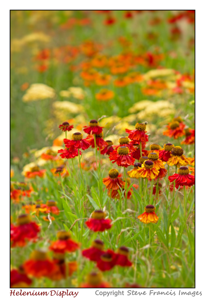
There are many flowers that have very interesting shapes and lines. Even if from a distance those for which the shape appears to be fairly simple there are ways to enhance shape and design in a picture. Many repeating flower heads brought together in the shot can create interesting patterns. And moving in close to the flower may also reveal details that bring interesting shapes and patterns for a macro shot.
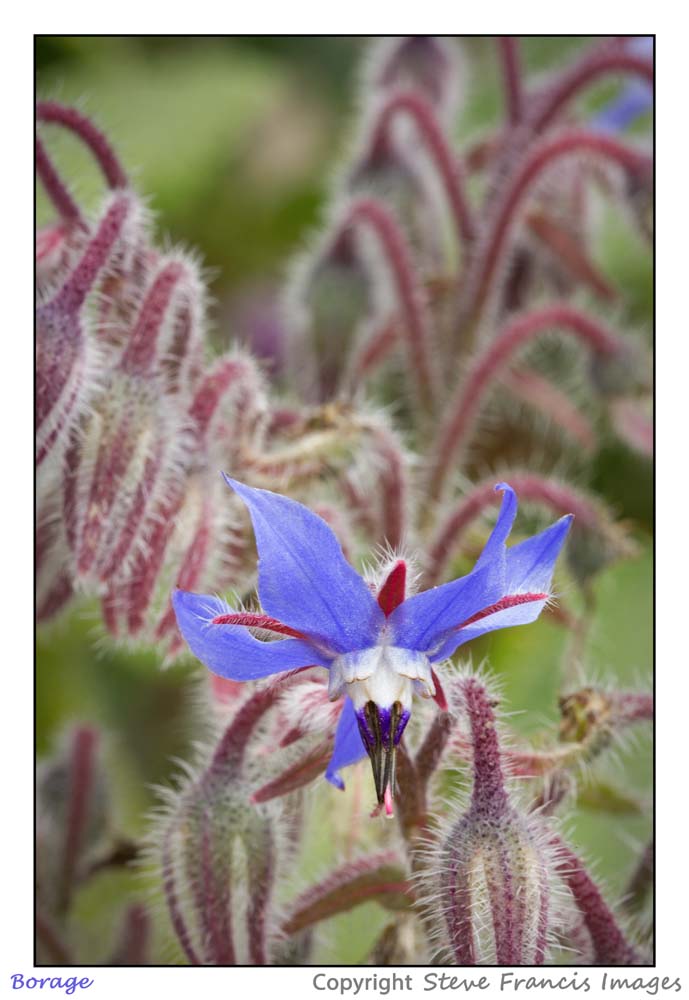
When considering floral portraits the important point is to take care of the whole picture. First and foremost position the main subject well in the frame. A central position can look static, the eye moves and is held in the middle of the frame and the engagement between the viewer and the picture often ends there. Try placing the main focal point of the picture off-centre; it leaves space around the image for the eye to explore before coming back to the subject.
Colours that are opposite each other on the wheel are contrasting colours. Setting a subject and background together with contrasting colours is a great way to make the subject really stand out and creates a picture that has instant impact on the eye.

Landscape photographers often apply the ‘rule of thirds’ to their compositions in which the main focal point is placed on one of the four intersection points in the frame when two vertical and two horizontal lines equally divide the frame up. This can be applied to floral photography but probably needs to be assessed case-by-case to decide if it works. If parts of a flower to be included extend well beyond the central focal point (e.g. long petals), which itself is to be placed on an intersecting third the flower might need to be that much smaller in the frame to meet the two constraints of the composition. In such a case it might be better to relax the rule of thirds to enable the main subject to appear larger in the frame.
If there are going to be several blooms in the frame try to pick one as the primary subject and make sure the viewer can see that you intend that this one is the main focal point. It ought to be fully visible and also be the point used for focussing the picture.
Once the main subject has been fixed check around the rest of the picture area. Other elements might create a distraction or, on the other hand, could possibly enhance the picture. Some obvious detracting elements that might sneak in include intruding plant labels, rigid plant supports or perhaps other plants that don’t add to the picture. There are some less obvious ones as well:
- Bright reflections off of shiny leaves leading to distracting over-exposed 'hot spots';
- Trailing stalks in front of or behind the subject that distract by cutting across the subject;
- Small bugs lurking on the flower head waiting to photo-bomb your image (believe me no gardener will thank you for showing images from their garden with these in the shot!).

Once all distractions are gone it’s also worth looking for other elements to make a positive contribution to the image. Just as for other genres of photography the usual tricks of the trade can be employed:
- Lead in lines (e.g. supporting stems, leaf veins, etc.) can draw the eye to the subject;
- Filling the ‘spare space’ with interesting out-of-focus foliage or flowers, providing it doesn’t become a distraction, can create a sense of depth in a picture;
- Diagonal lines are strong photographic design elements that can give an image more impact (e.g. try to have supporting stems leading in at an angle rather than just straight up).
Of course, there are physical constraints as to how the plant grows making some of the suggestions difficult to incorporate, but looking around to see which plant and flower provides the best combination of some of these design elements can help to make a picture with more visual draw.
The next blog on floral photography will look at external factors that have an influence the composition of a picture.