
The appeal of floral photography may seem obvious on the face of it, on most occasions it is simply a massive colour hit providing shots with instant impact. Whether it’s fiery reds, sunny yellows, moody blues, and even clean pure whites there is something that will give a photograph instant lift and can evoke a mood. Just like the bees, a floral photographer is captured and drawn in by the nature’s clever and attractive design that makes the flower irresistible.
To understand and manage the colours in a photograph it helps to be familiar with the colour wheel. Adjacent colours on the wheel are described as complementary colours; bringing several of these similar hues together is a way to strengthen the feel of the picture through the use of colour. On one side there are the reds, yellows and oranges that give the picture vibrancy, whereas blues and greens offer a more relaxing tone.
Colours that are opposite each other on the wheel are contrasting colours. Setting a subject and background together with contrasting colours is a great way to make the subject really stand out and creates a picture that has instant impact on the eye.

The colour wheel and the relationships between colours on the wheel can be used to create a colour scheme for floral photography in much the same way a colour chart is used when designing the room of a house.
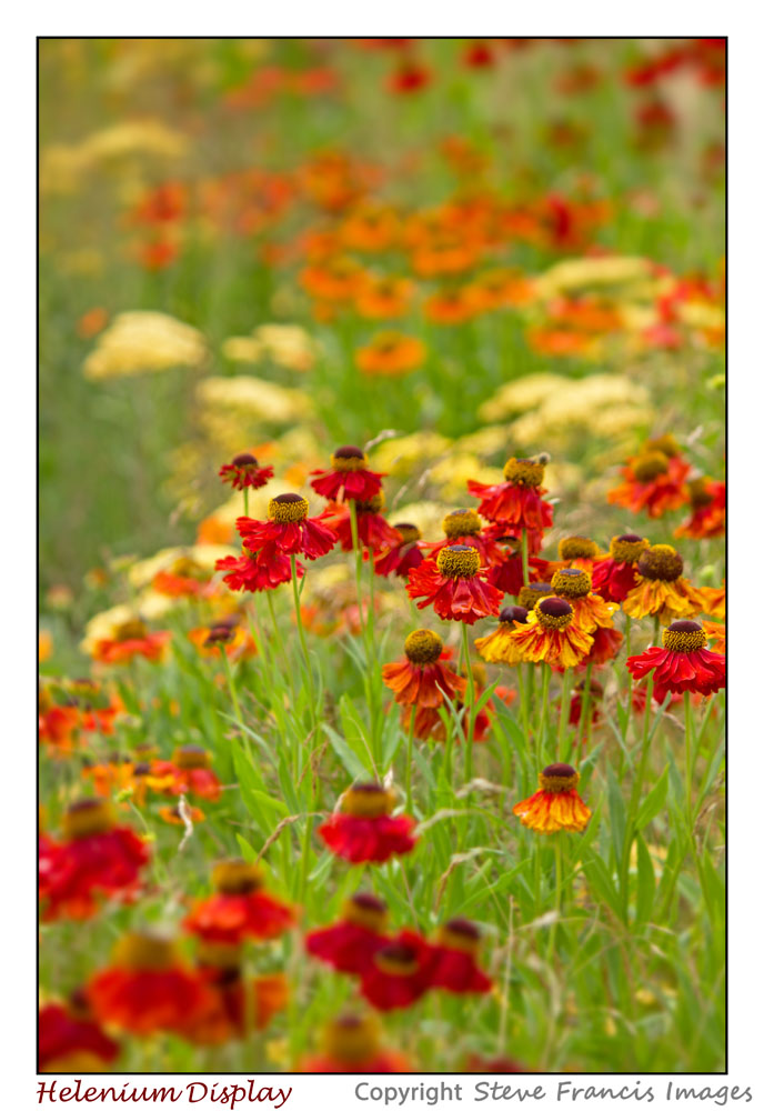
The most obvious background colour when taking flower shots is of course the green foliage. Opposite green on the colour wheel is red, so a single red flower against the green foliage can create a very striking and satisfying shot.
There is another effect that makes the combination of a red flower on a green background interesting, and that is the fact that when viewed objects with a red colour can appear to advance out of the page towards the viewer, whilst shades of blue or green can seem to recede. This means that a red subject on a green background can appear as though it is sitting off of or above the page and create a kind of three dimensional effect for the picture.
Colours can also be described as warm or cold (red is warm and blue is cold). The colour temperature can be changed by adjusting the white balance in the camera. Very often shots are taken using an automatic white balance. This means that the camera will try to judge the colour temperature of the scene and try to modify the colour temperature to something that it thinks is suitable. The camera can be fooled if there is a dominating subject that has a single colour and the camera can make incorrect adjustments that affect the final colour captured in the image. For this reason it is always recommended to select a white balance rather than rely on the camera’s decision by leaving it on the ‘AUTO’ setting.
The next blog on floral photography will look at other factors when in the initial stages of deciding to take a picture with a flower or flowers as the subject.